The Catholic Review Redesign
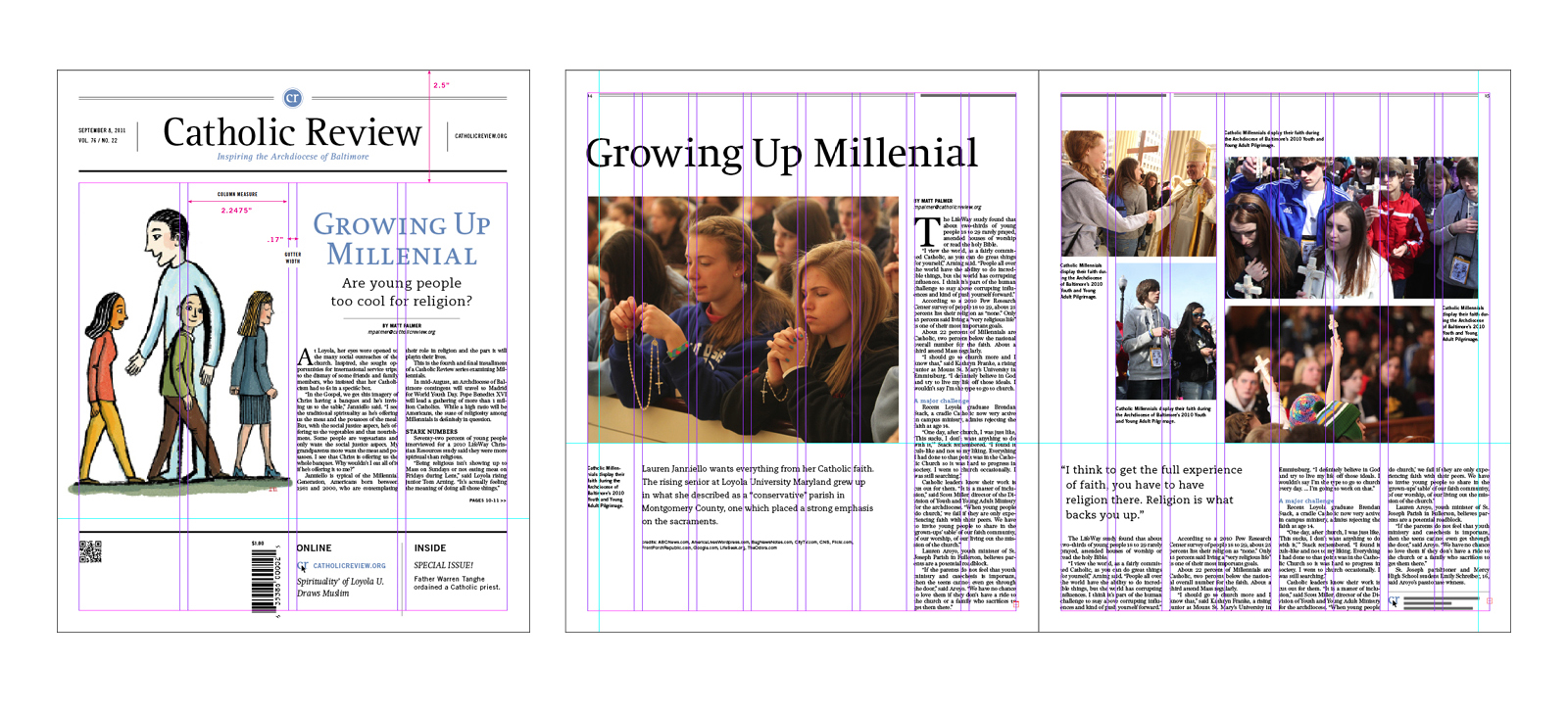
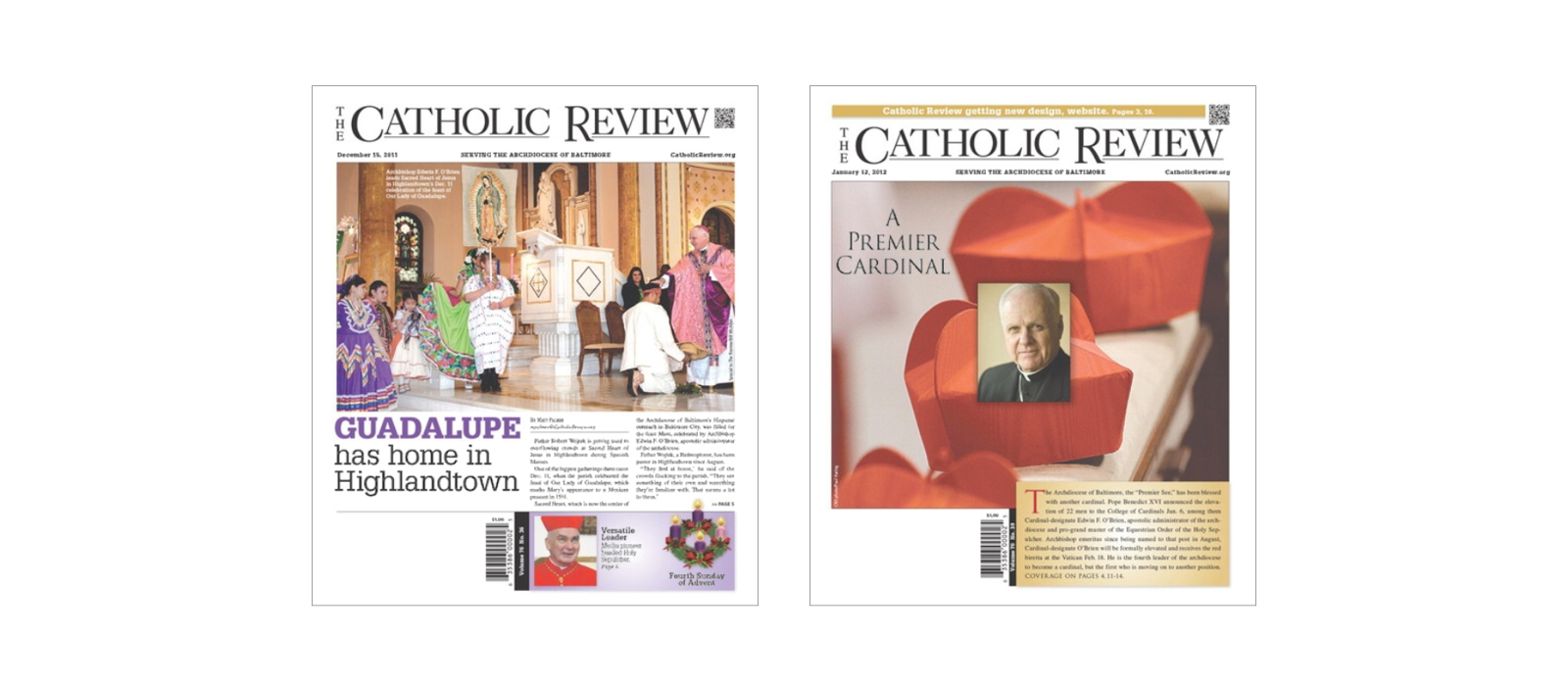
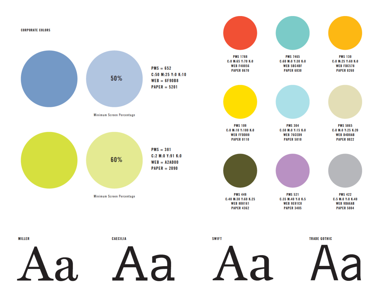
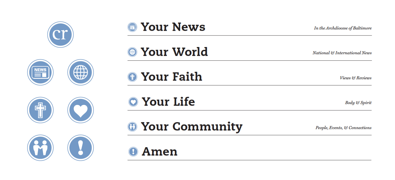
The Catholic Review is a local newspaper that wanted to refresh their look to appeal to the younger audience while still having a sophisticated design to appease their current audience as well. A new masthead was developed with a classic and modern appearance and a brighter color palette was introduced. A series of icons and headers were created to visually organize the sections of the newspaper and a grid structure was formed so that there would be more flexibility within their design in contrast to their original 3-column grid.
Original Design
Redesigned Cover and Pages
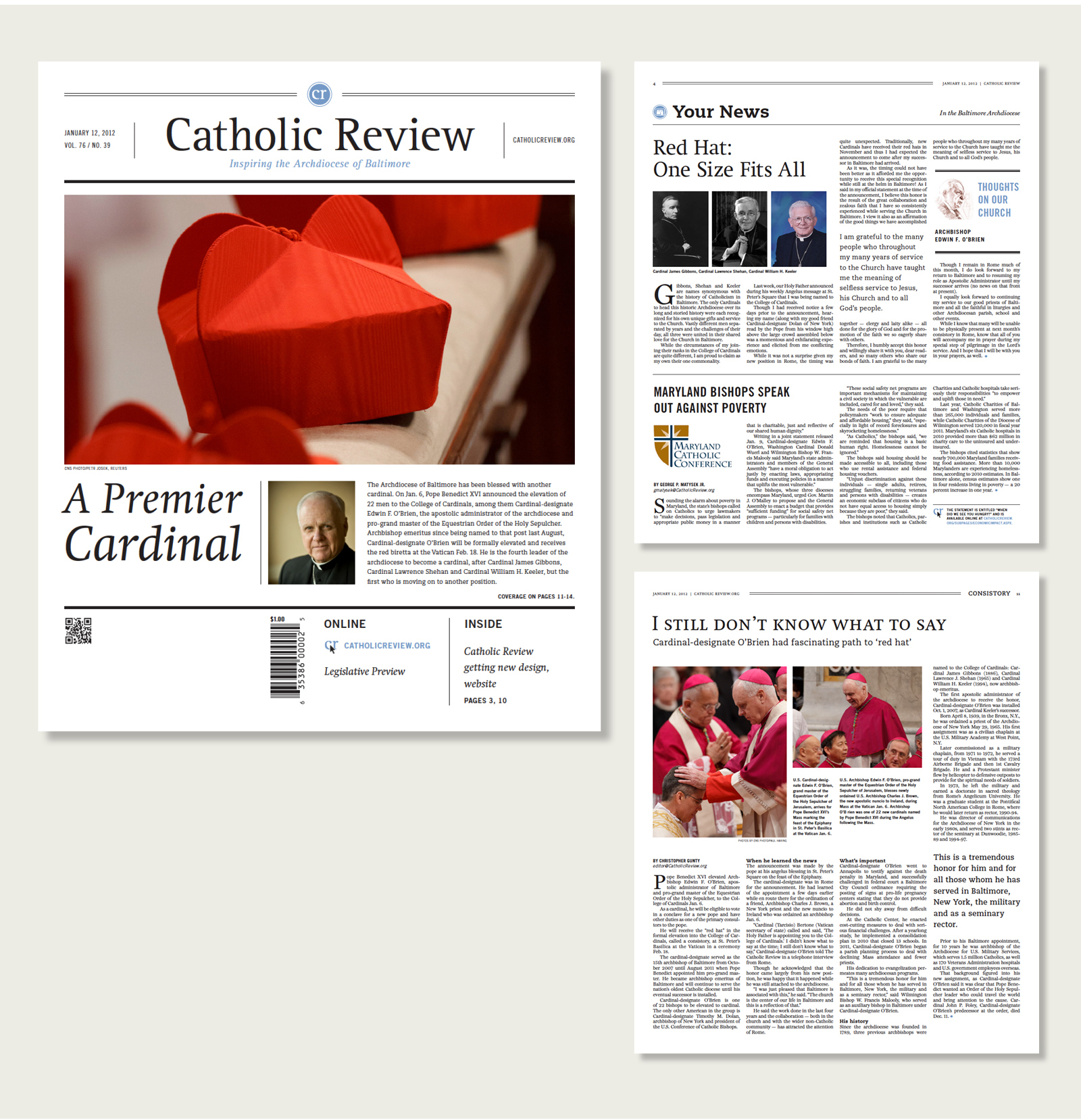
New Masthead

Colors and Fonts
Icons and Headers
Page Grids
